Melissa Chukri Design Portfolio
Rapid Prototyping
Design:
Our task was to (very quickly) design a tablet app that can be used to (very quickly) place an order at a Café. Then (very quickly) construct a paper prototype that can be used to (very quickly) test our design. Next, we found someone who wanted to (very quickly) place a coffee order and we (very quickly) ran a small user test with them to evaluate our design.
Prototype:
To overcome the challenge of rapidly changing sticky-notes that usually comes with paper prototypes one of my group members came up with the ingenious idea to make an iPad cut out that we could move along multiple screens. Each of the screens had a set of sticky notes that corresponded to the possible interactions for that screen. We chose to create it this way so that we weren't limited by a one-way scenario for our user tests.
Analysis:
On first user test we found we forgot an important component, a cancel drink interaction. Such a simple element, essential to UI. This error showcased the importance and usefulness of paper prototypes. With a simple modification, we were able to proceed with the user testing.
Paper Prototyping
 |
|---|
 |
 |
 |
 |
 |
Wearable Interface
 |
|---|
 |
 |
 |
 |
 |
 |
 |
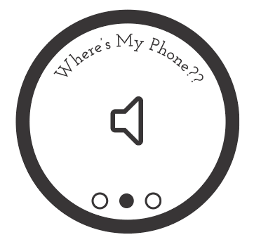
Design:
I created a quick paper prototype of a smartwatch app to help to locate the paired phone. The video to the left shows 3 interaction types: vibration, melody, flashlight. These 3 interactions can be turned on independently or simultaneously to help a user locate their phone. If they are somewhere private or they don't want to make too much noise, they can activate the phone's vibration or flashlight. They can also activate a melody, and adjust it's volume.
Prototype:
Using paper and sticky notes I created an oversized watch device. Each of the possible interaction screens was put on its own sticky note that would be displayed to the user in user testing. With each interaction (swiping gestures) I changed the sticky notes to reflect the screen change. And Wizard of Oz'ed the reaction on the paired phone. I modeled the gestures for my app off watching my initial user (a Moto360 owner) use his device. I noticed the primary interaction styles were vertical and horizontal swipes and taps.
Analysis:
My first user, a smart watch owner, needed very little instructions; I wanted to see what he would do with it. I instructed him to try to interact with the device and he used the tool as designed. When I presented the new screen he interacted with the icon by clicking on it. I was pleasantly surprised with the success of my first user test. My 2nd user test was with a non-smartwatch-owner. It was then that I realized the applications lack of instruction or indication that there were multiple modes. Through discussion with my peers, I realized that the addition of arrows on the sides, or small circles at the bottom would have given an indication to the user that there are additional screens/modes, this addition could encourage a swiping interaction.
Iteration:
To show what I took away from my peer feedback I created the animated gif to the left which has circles at the bottom to indicate multiple screens or modes, as well as help text that appears or on the first use of the app or if the user hesitates on a screen too long.
Model Prototyping
 |
|---|
 |
 |
 |
 |
 |
 |
 |
 |
Design:
We were tasked to create a quick, low-fidelity prototype of an “EcoATM”, an interactive kiosk for recycling your used electronic devices like smartphones for cash or other value.
Prototype:
We started with a cardboard box we created a tall back, for where our buttons and touch display and added a device scanner area. In the scanner area, we had one section for the user's identification card and another area for the phone. The area designated for the phone had adjacent cords for the user to plug in their device. This area also had a trap door; if the user chose to sell their device the trap door would open allowing the phone to be collected. The scanner door also had window area, so that they could see their ID and phone, to ensure they were items were safe. Our interactions were simple. Once the scan began, the machine would give the user a preliminary estimate for how much they would receive for their device. If the user didn't think the offer was worth completing they could cancel their transaction and retrieve their items.
Analysis:
In our fist usability test we discovered a few basic interactions we needed to fix, our scanner drawer didn't have a handle, additionally the instructions we had on the initial UI weren't clear. With a few really quick modifications our tool was much easier to understand. Our final prototype achieved our goal of reducing the number of interactions; the initial design had over 10 interactions and our prototype had to 3-5, depending on whether f the user chose to sell their device.
Object Prototype
Design:
The purpose of this assignment was to gain experience with designing and building a 2D object using a laser cutter. Our challenge was to build a stand that will firmly support a smartphone for the purpose of shooting video. This design began with some online research of other phone stands and looking around my house for objects that could double as phone stands. I found a shelf that is "L" shape allowed for easy access to the display while not impeding the camera's view. Its shape seemed simple and with a few modifications it would work perfectly for this task. I choose to use this shelf as inspiration and began with a cardboard.
Prototype:
I began by sketching out the pieces I'd need to cut. My initial plan was to create all the edged of the shelf, and hinge all the pieces together into a hollowed 3D shelf. Unsure how I'd hinge all my pieces together I decided to seek guidance of a Mechanical Engineer friend. He advised my that I could create essentially the same item with more simplicity after we sketched some iterations of my initial design. I first build a prototype in cardboard, then created the artifact in Rhino, the 3D modeling software, which I'd use to print the design with the laser cutter.
Analysis:
The final printed item worked well, the phone could be placed in the device landscape or portrait, and the stand didn't impede the camera's view. It held the weight of the phone and was sturdy and stable phone stand. On my first user test after printing, they mentioned that the stand wasn't adjustable, in that it doesn't allow for the camera angle to change. My design was focused on stability and designing an item that could hold the phone without impeding the camera or toppling over.
 |
|---|
 |
 |
 |
 |
|---|
 |
 |
 |
 |
 |
 |
 |
 |
Ergonomics
 |
|---|
 |
 |
 |
 |
 |
 |
 |
 |
 |
 |
 |
Design:
Tasked to design a quick 3-D lo-fi prototype for a handheld immersion blender with a variable speed control and a digital display that senses when the contents have achieved a specific consistency.
Prototype:
I started with a whisk I had in my kitchen and added a paper towel roll to the handle, which is where the digital display and speed control would be located. I added a digital display for the viscosity readout with sticky notes, I made an adjustable indicator of to show the consistency and adjacent buttons to change these settings. For the speed adjustments, I used an empty toilet paper roll at the end of the handle to simulate a rotatable end and added red arrows with a (-) signs and green arrows with (+) signs indicated the direction to turn the end of the device.
Analysis:
The first iteration had a switch with the binder clip, but in my first user test it wasn't apparent that the binder clip was a switch. So on my second iteration, I implemented a switch made with a sticky note. The second suggestion was that placement of the buttons and the digital display was in the way of where he wanted to place his hand. On my second iteration, I quickly moved them lower on the device and rotated them to a landscape orientation. Finally, I got positive feedback of my speed dial, the user told me that he felt the location and labeling were intuitive and easy to execute while using.
3D Object Prototype
 |
|---|
 |
 |
 |
 |
 |
 |
 |
Design:
This assignment was to develop our ability to create 3D models for prototyping physical objects at medium fidelity. My design utilized both extrusion and revolution. I used Solid Works to make my model. A friend who was familiar with 3D printing and Solid Works helped me with my design. He helped my maintain at least a 45-degree angle on some of the sharp corners so that the edges of my print wouldn't fall.
Video RAPID Prototype
Design:
This assignment was to create a video prototype for the One Bus Away mobile is to highlight the scenario and use cases for the application, We had 90 minutes, to sketch a storyboard our video, shoot the video, edit it and upload it to be shared with the class.
Prototype:
My team began sketching a scenario we decided to each sketch our favorite aspect of the app, we decided to omit dialog, we didn't have time to write or rehearse it. Once we decided on the scenario we were going to use we went out and began shooting. We took multiple videos takes of the same scene so that we'd be able to choose when we were ready to edit. Once we finished shooting we put the clips in, added a few subtitles.
Analysis:
We moved fast, The end product video was simple and got the point across.The added subtitles did a great job adding to the value we were trying to convey with our prototype/product demo. We wanted to express that by using this application you don't have to wonder when the next bus is coming!
 |
|---|
 |
 |
Part 2
Design:
The subject of this assignment was to video prototype that demonstrates clearly and effectively the functionality of a product. I chose to further the exploration of the One Bus Away application. The assignment was to think of this as a concise product pitch that you might use in seeking an investor for your design. My favorite feature of One Bus Away is that you don't waste time sitting at the stop, wondering when the bus is coming, but instead you can catch a bus whenever you are ready, and be confident that one is on its way.
Prototype:
I began sketching 2 scenarios that I thought demonstrated my favorite aspects of the application. This app enables users to: spend time where you want, with the ones they want, doing what you want; instead of waiting at a bus stop. With that in mind and my sketched scenario, I took a bus trip into Seattle with my husband and I captured moments of our trip. We got off the bus near pike place and enjoyed the day wondering around Seattle. We enjoyed capturing iconic views of the city and placing the camera in places to record us together. When we were ready to head home, we searched along the route we took from our house to see which stop we were currently closest. to We didn't have to pay for parking, we didn't have to walk back to the car, and we spent time together, where we wanted!
|
|---|
|
 |
Wizard Of Oz (Behavioral) Prototyping
Design:
This assignment gave us the opportunity to try our Behavioral Prototyping, also playfully called "Wizard of Oz Prototyping." This technique can be very effective in testing design assumptions for HCI applications when the actual technology is either not available or too expensive to develop during the design phase of a project. We chose to make a wearable posture assistant that would help user's learn a yoga position through audio cues. Our participant would be our Dorothy, the operator would be our Wizard. Our objective would be for our prototype to be so seamless and responsive that our "Dorothy" would think the "Wizard" was real!
 |  |
|---|---|
 |  |
 |  |
 |  |
 |  |
 |  |
 |  |
 |  |
 |  |
 |  |
Prototype:
Test Plan:
We booked 2 study rooms adjacent to each other. We had a fanny-pack that was weighted to mimic an Arduino board and sensors. We use 3 laptops - two would be used to Skype with each other so the Wizard could see Dorothy in the other room, and the third would be used to send the audio and haptic feedback to prompt the user. We also used a Microsoft Kinect to aid in the perception that the user's posture is being observed. We built a website (shown the in the slideshow) that the user would interact with to choose a workout which initiated the system and enabled the Kinect to "track" the user's posture. Once the system was initiated, the wizard began acting as the system, prompting audio instructions to the user to walk them through the exercise. The audio cues were pre-recorded with a computerized voice to increase the believability factor. We recorded many clips to play for the user, step-by-step instructions, affirmations, and adjustments.
User Test:
During the test, our the user followed the prompts as they were given, chuckled as the system told her "Good Job" and successfully completed the Yoga pose. After the experiment we asked her to evaluate the system, she stated that the system was well programmed and thought it was a nice alternative to having to watch a workout video.
Analysis:
Dorothy believed our wizard prototype! When we revealed it to her that I was operating the voice commands she was shocked and amused! Our design goals were to see how detailed audio instructions needed to be for users to be able to complete and perfect workouts and postures. We also wanted to understand how willing are users to listen to directions given by a machine. Our tool was a success because we found that our user enjoyed the audio directions. In addition, she was able to fully complete the Yoga position. The purpose of this kind of prototyping is to identify ways to improve a system before it proceeds to a costly development phase. From ur user test we learned that the kinds of prompts given were clear and understandable but the language used may have needed a few more alternative. For example, one step was "Turn your torso towards the front" But our user didn't know the term torso, so she asked the system "What?" If the system were to be developed a cue like this from the user should prompt an alternative instruction to help the user better understand the step. identifying small things like this to adjust early in the design phase save teams time and money.
INTERACTIVE PROTOTYPING - AXURE
 |
|---|
 |
 |
 |
 |
 |
 |
Design:
Tasked to design a mobile application prototype! We could expand on a previous prototype we had done in the class or create our own! I love hiking and exploring the Pacific Northwest so I wanted to design an easy tool that would suggest hikes to users! Users could input the duration they'd like to hikes, the difficulty and how far they'd like to venture away from home. From there my app would suggest a hike/trail the could enjoy! I began with sketches of the kinds of interactions I wanted to be in the application. Afterwards I began to design a high fidelity UI for the application. For this exercise we were assigned to skip the lo-fi phase and jump right into hi-fi mock ups. With that, I took the opprotunity to practice Visual Design! I wanted to play with the trending frosted glass style that's so popular right now, I also thought this design aesthetic was fitting for the kind of application I was designing.
Prototype:
I've made many Axure prototypes but enjoyed designing with a mobile device in mind. The icons and interaction points needed to be larger than in a web design, and screen size is much smaller so relestate is more valuable! I enjoyed using both Illustrator and Axure to make this prototype. I designed the application in layers which made it easy to make changes in the UI design as I built the prototype in Axure. You can visually design an entire UI but it isn't until you interact with the Axure prototype that you remember the need for elements like a back button. : ) Finding missing essential items like this early in the design phase is critical, and Axure prototypes allow you to do that!
Analysis:
I got tons of feedback about the visual design. Users thought the application was beautifully designed. They also liked the flow of interactions and felt that the tool would help them find a hike/trail near them that met their needs. They had questions though about what defined difficulty levels? It may be helpful to implement an information icon to elaborate on the details, or have the user be able to expand this choice if necessary to possibly include more elements other just elevation changes, such as trail hazards. An additional thing a user suggested I add, is scenic preferences. This user is an avid waterfall lover, and would like to be able to find hike around there he could see new rapids/waterfalls. Lastly, users liked the amount of detail that's displayed for each of the suggested hikes, including the icons about each of the hikes.
FINAL PROJECT
Collaborative HUB
An online space to help collocated teams feel like they in the same cubical.
Goal
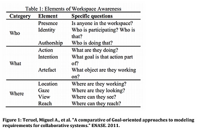
To design a desirable space to help separated team members collaborate efficiently and effectively. if elements/features I'd desirableI want to find out if this tool I'm designing would be intriduced would help users ease some of the challenges faced by geospatially diverse teams. My idea take on foundational elements from many existing collaborative platforms. I wanted to take the best from each of these spaces and design a prototype of a new system that achieves collaborative space design requirements based on my literature research. From my literary research, i found it was important for users to be able to understand the “who/what/where” within the space. Demonstrated below in the a table from, Miguel A. Teruel’s "A Comparative of Goal- oriented Approaches to Modelling Requirements for Collaborative Systems."
 |  |
|---|---|
 |  |
 |  |
 |  |
 |  |
 |  |
 |  |
 |
Prototype: paper prototype & Axure lo/med fidelity clickable prototype
For my 419, Concepts and HCI course I’ve been doing extensive research on design requirements for successful online collaborative spaces. I want to make a prototype that has rationale for design decisions that is grounded in the research I’ve done. I want to sketch and test an initial UI design to identify if concept, iconography and layout make sense to user. I’ll then ideate on this feedback and implement a lo/med fidelity clickable prototype using Axure. The system requirements would be to:
-
within the design, these components were identified as items that were essential for users success in online collaboration. (from reading "who/what/where"Allow user's to be able to easily and quickly understand the by: Teruel)
-
The “who” would be addressed through the use of an advanced avatar system that change based on the users participation in the HUB (from readings by: Erickson & Schroeder).
-
information and socio-emotional information. This allows user's, regardless of their geospatial location, access to the same amount of context and face-face work relationships (from reading The "what" will be addressed through giving the user the necessary contextual information, task by: Aragon)
-
-
Additionally it'll encourage cross discipline collabortion - the hub would have a sophisticated search feature that would allow users to collaborate and search via user added tags so users can use and build on existing knowledge (from reading by Lee).
I'll evaluate my designthrough user testing at both the paper prototype and Axure phases I’ll ask users to complete a set of tasks. Depending on the ease of completion of these tasks I’ll determine of the design feature in question was a success/failure at the point of the user tests, if I feel the task wasn’t completed with the ease I desired, I’ll ask the user to elaborate on the difficulties of the task and ask them to suggest alternative solution. Some tasks I’d like to test for:
-
Initiate a conversation with the team
-
View a expanded card
-
establish who is editing the file currently
-
where they’d view previous versions
-
add a topic tag to the card
-
-
Identify a task card with about a topic of interest.
-
Which users are active in the space vs those we are dormant/offline
-
Have users to establish which document certain users are currently using
Analysis:
Paper Prototype Tests:
The paper prototype tests were very successful, in this phase I was looking to see what users thought of the overall layout of information. I asked them to interact with simple shapes and describe what they thought they would produce or what they would mean. I also asked high level questions to tie back to the concepts I'd been reading about - for instance because I couldn't demonstrate the ideas of "live" avatars in nither the paper nor the axure prototype I asked questionabout their thoughts on current avatars they interact with, and asked how they'd improve those systems and finally their thoughts on animated avatars. From my paper prototype I learned from my users that the overall idea was well executed and that this kind of tool could be helpful for non collocated teams, also from the paper prototype my users said they felt the tool was usable, although the vague titles did cause some confusion.
Axure Prototype Tests:
The axure prototype was also successful. I kept it mostly black/white - low fidelity because I'm working to iron our the layout of informaiton and the featuers to implement. I added titles and had a scenario so that my users would have a sense of context before they began to use to tool. The only color I added was for the user icons. For the axure prototype I walked user's through a scenario to see how they'd interact with the tool. These tests didn't go as smoothly as I'd hoped but they commented that their confusion was mostly with labels or lack thereof. But the overall take away from the tests was that the overall idea was great. From my tool they could see who was in the collaborative space and what the content was about. They also felt that this platform could give them a better sense of who is in charge of which projects, and the chat areas would make for easy and quick communication regardless the distance. Because of the protptypes low fidelity, it was hard for users to say whether they'd be encouraged to use the tool, but upon further iteration they said their oppions may be changed.
To conclude - this prototype still has many areas of improvement. I'm going to continue to work on it and build a annotated wireframe that goes into additional details about the rationale behind the design decisions that I grounded in my research. Below you'll find the literary sources I referenced.
-
Teruel, Miguel A., et al. "A Comparative of Goal-oriented Approaches to Modelling Requirements for Collaborative Systems." ENASE. 2011.
-
Aragon, Cecilia R., et al. "A tale of two online communities: Fostering collaboration and creativity in scientists and children." Proceedings of the seventh ACM conference on Creativity and cognition. ACM, 2009.
-
Schroeder, Ralph, and Ann-Sofie Axelsson, eds. Avatars at work and play: Collaboration and interaction in shared virtual environments. Vol. 34. Springer Science & Business Media, 2006.
-
Lee, Jinhee, Carlos Perez-Rubio, and Ken Mohr. "Liquid Labs: Designing for Collaboration." Laboratory Design News. N.p., 9 Oct. 2014. Web. 07 May 2015. <http://www.labdesignnews.com/articles/2014/10/liquid-labs-designing-collaboration>.
-
Seebacher, Noreen. "Discussion Point: Creating Long Distance Collaboration and Teams." CMSWire.com. Managing Your Digital Ecosystem, 11 Nov. 2014. Web. 08 May 2015. <http://www.cmswire.com/cms/social-business/discussion-point-creating-long-distance-collaboration-and-teams-027121.php>.
-
Gartenstein, Devra. "Advantages & Disadvantages of Collaboration Between Businesses." Business & Entrepreneurship. Demand Media, n.d. Web. 07 May 2015. <http://yourbusiness.azcentral.com/advantages-disadvantages-collaboration-between-businesses-12644.html>.
-
Erickson, Thomas, and Wendy A. Kellogg. "Social translucence: an approach to designing systems that support social processes." ACM transactions on computer-human interaction (TOCHI) 7.1 (2000): 59-83.
-
Kraut, Robert E., and Resnick, Paul. Building Successful Online Communities : Evidence-Based Social Design. Cambridge, MA, USA: MIT Press, 2012. ProQuest ebrary. Web. 26 April 2015. Copyright © 2012. MIT Press. All rights reserved