Melissa Chukri Design Portfolio

ONVIA
Onvia is a software company that is building complex sales and intelligence solutions for the Business & Government market. If you're a small business looking for contracts and opportunities to sell your product to State and Local Government Agencies, Onvia is the leading B2G sales intellegence tool in the market.
My Contributions to Onvia


Usability Study: Design to Findings

Design Source of Truth

Hackathon - Rethinking Notifications

Team Usage Analytics
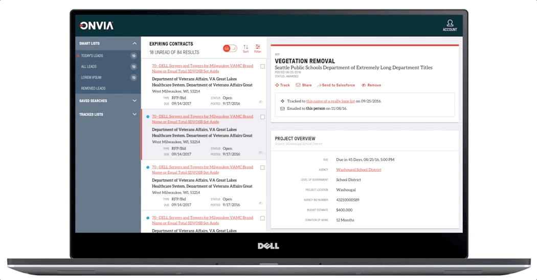
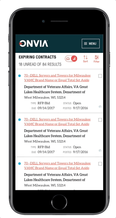
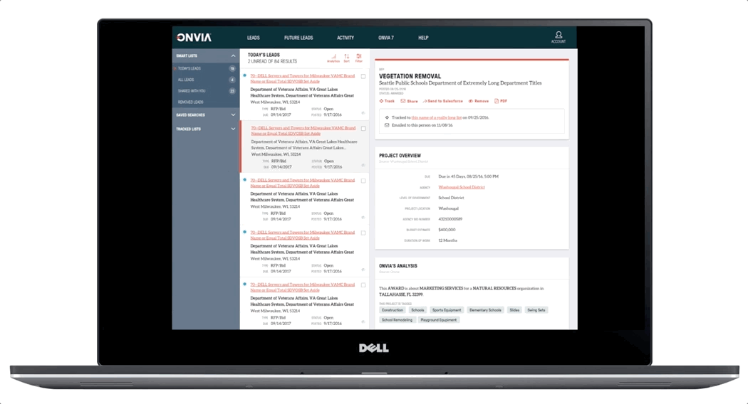
Future Leads Analysis - Expiring Contracts
This was my first project with Onvia and I was thrilled at the prospect of how much impact it could have on our user's productivity. We'd been receiving user feedback and analyzing usage data, and we found a very valuable dataset of ours was going unused, leaving an entire persona unaccounted for. To understand what was causing this lack of usage we went to the users and asked. We found that the way the data was presented wasn't adequate for the kinds of planning and projecting this persona did. Since the product had only been live for a few months this kind of feedback was exactly what the product team was looking for to expand our product.
 The Original UIThis was the original list view which had limited sorting and filtering capabilities. |
|---|
 Sketches |
 Sketches |
 |
 Sketches |
 Design Exploration |
 Another Design Exploration |
 Mobile Design Exploration |
 Mobile Design Exploration |
 |
 |
 |
 |
Think Big
While we were learning and discovering the exact problem we were trying to solve in this space we went broad. Reaching out to users we identifying valuable scenarios we'd missed the first time, and together we explored representations that would be a beneficial and efficient way to view this data. After the team rationalized the most important key interaction points design work began.
Design Iterations
The team had decided to prioritize the data representation by location, level of government, financial opportunity size and the date. Once delivered we'd give users a tool to aid their ability to build a list of highly qualified future opportunities that can be exported for use in a pursuit strategy.
With these parameters I iterated on many designs shown to the left, some focused on highlighting the geographic aspect of the data others on the opportunity value. As a Product team, through design reviews, we narrowed our focuses and landed on an MVP.
Strategic Decision
Because of an urgency to seize the market opportunity, Product made a strategic choice to postpone usability testing would be held until after development was complete. The benefit of being in a small company is that I was able to work exceptionally close with the development team, and as the feature took shape we were able to make UI modifications during production. The developers were in these conversations so they were onboard and understood that UI modifications would be coming after we ran the usability study, having this openness in communication and plan always helps team collaboration. In addition, the decision to wait to run usability tests until the product was live, gave the users the ability to see the feature in the context of their business. For many users, they are deeply knowledgeable about their market and so we also believed testing with "fake data" wouldn't yield the best study results.
Usability Study
I designed and ran 2 usability tests for the Future Leads Analytics view, and the new Commenting feature inside leads. Both features were newly added functionality for our platform that stemmed from repetitive user feedback and preliminary user research. After the release of the features, we wanted to circle back to identify further improvements to the features. Commenting allowed teams to keep context and conversations around leads, and minimized noise and loss of information in messy email chains. The Future Leads Analytics view gave users an alternative visual view the list data they were used to. By being able to see visually patterns and concentration of leads by contract value and location, users would be able to more efficiently make business development decisions.
 Worksheet from Usability Study |
|---|
 Worksheet from Usability Study |
 Collection of findings |
Recruiting Users
Both features had a set of users that we gathered initial user research from, they were a natural set of users to recruit for the study. We also used our usage analytics to see which users often used certain aspects of our product that contributed to them being candidates to the study. And we collaborated with our Sales, and Client Success Teams to identify clients they felt would provide adequate feedback.
Design & Moderation
I designed scripts for each of the test to ensure consistency across all tests, and each script was based on user stories created by the product team, to ensure that our execution of the feature had met our initial intentions. I then practiced the scripts with internal stakeholders to get feedback on the tests, after a few minor tweaks I was ready to begin the real tests. Because all of my sessions would be done over web-based conference calls, I asked the users to share the screen and walked them through the script. I also asked users if I could record the session, it helps me be more present and ___ in studies if I don't feel like I need to be frantically writing notes. Lastly, since this was one of the first usability studies my small company had done, there was a lot of team excitement. I had many team members from Development and higher management sit in eager to be apart of the feedback.
Findings: Knowledge Sharing & Next Steps
After the sessions were complete, I reviewed the session recordings and noted additional details. I collect findings in an excel spreadsheet. It allows me to holistically see the data, and group similar kinds of feedback to see trends. To present the findings and next steps with my team I sent out a document containing a high-level summary of each of the studies, with my suggested next steps, followed by a more detailed report, and finally, the actual data was available in the appendix. Next, I set up 1:1 meetings with the Pm's to prioritize these changes and then they were brought into the sprint cycle. When it came time for the developers to groom these stories, I sat in on the grooming sessions to share the findings of the studies with the developers so that they were aware of the feedback and the rationale behind these changes.
 |
|---|
Working closely with developers
The developers were already in the mindset and creating components so that they'd be reusable, but I intentionally included them in the conversation early in the development of Expiring Contracts to ensured that the components would be ready to ingest the next data set. I also worked with Project Management so that the same Front End sprint team would be chosen for each leads analysis area, to ensure the quickest development. When the team started on the Analysis Features, we wanted to get both the areas out in Q4, we were successful because of the reusability of the design components and the code. Development praised my foresight of the project's roadmap and noted that the feature release was possible in the short time because of the close communication between the design and development.
Expanding the Pattern: Planned Projects
It was on the roadmap to extend an analysis feature to the Planned Projects section of our platform. Because the problems being solved in both areas of the platform were exceptionally similar, it was my hope that the majority of the UI would be reusable between the two sections. This would give our users a consistent experience across the platform, we'd be able to use UI elements that were already vetted in our usability study, and because the components had already been developed by users we'd be able to quickly switch plugs on data set, and make a few changes and have a completely new feature ready to release with a minimal development effort.
Team Usage and License Allocation
License allocation was the next top prioritized ask from our users, it was a known metric that teams that were using our platform more often were consistently more pleased with their purchase of the product. We wanted to give management a tool to see into how their team was suing the tool. All of this data was previously being aggregated by internal Onvia support members, so to eliminate that resource loss we aimed to build a ui that allowed the users to answer the questions most commonly asked of the Onvia support members.
 understanding the needsexperience map and user journey |
|---|
 sketching concepts |
 sketchesHighlighting KPIs |
 |
This feature has just begun!
Check back soon!
Content will be being added soon. Can't wait to know about this project, contact me!
Source of Truth - UX Design System
I took it on my self to take Onvia's existing UX Patterns Source file and expand it to make the absolute most of it. My first week with the team i familiarized myself with the established design patterns be enhancing the existing sketch file with the tricks I had picked up while developing Vertafore's Standards.
 The Sketch Component Library |
|---|
 Affordance AdditionAdding an animation for when a lead is removed, so that it's not as jarring to the user when the ui only jumps, a little. |
 sketches of animations |
 |
 Affordance AdditionAdding tombstoning and load animation to show that the ui is loading and hasn't froze or errored out. |
 Affordance AdditionFixing a broken UI element |
 demonstrating a broken UI element |
 Tightening up spacing |
 Tightening up spacing in the UI |
 The Sketch Component Library |
Enhancing the Existing Design System
The Designers at Onvia were already well versed in Sketch, and had a fairly thorough library of their components, but there was room for improvement I taught them about overriding symbols and text styles, I used my first week the team to familiarize myself with the UI and update the Truth document so that compoents and patterns were well documented and managed. I then introduced my fellow designer and the developers to FramerJS to showcase quick prototyping and animations. These tools were adopted and the developers loved that I hosted my prototpes and documentation online for them.
The importance of animation and Affordances
The initial releases of Onvia 8 were quick, and animations and affordances were left out for the sake of getting the product to market. But when i joined the team there was a real gap in affordances, items would "pop" in and out of existence and it was quite jarring. I used my skills in FramerJS to show the team how a few simple animations would translate into an overall better experience. Because the animations were already in code, it made it very easy for the developers to tinker in their downtime and sneak these animations into sprints and get them out in releases.
I also won the 2017 Onvia Hackaton!
We hacked together an improved notification system for Onvia8. We built a working prototype that showed internal stakeholders how this system could be implemented. A goal of the company was to move more users into the system for longer stretches of time, we had data that showed that the longer users stayed engaged with our platform they had a better return on their investment into our SaSS solution. This solution impressed the judges and stakeholders and we won the hackathon!
Title
Content will be being added soon. Can't wait to know about this project, contact me!
 |
|---|
 |
 |
 |
 |